SaaS Landing Page Refresh
The Challenge
A promising B2B SaaS company was facing a common hurdle: their innovative product wasn't translating into trial sign-ups. The homepage, their primary digital storefront, was failing to convert visitors, indicating a disconnect between the product's value and its presentation.
Our Approach
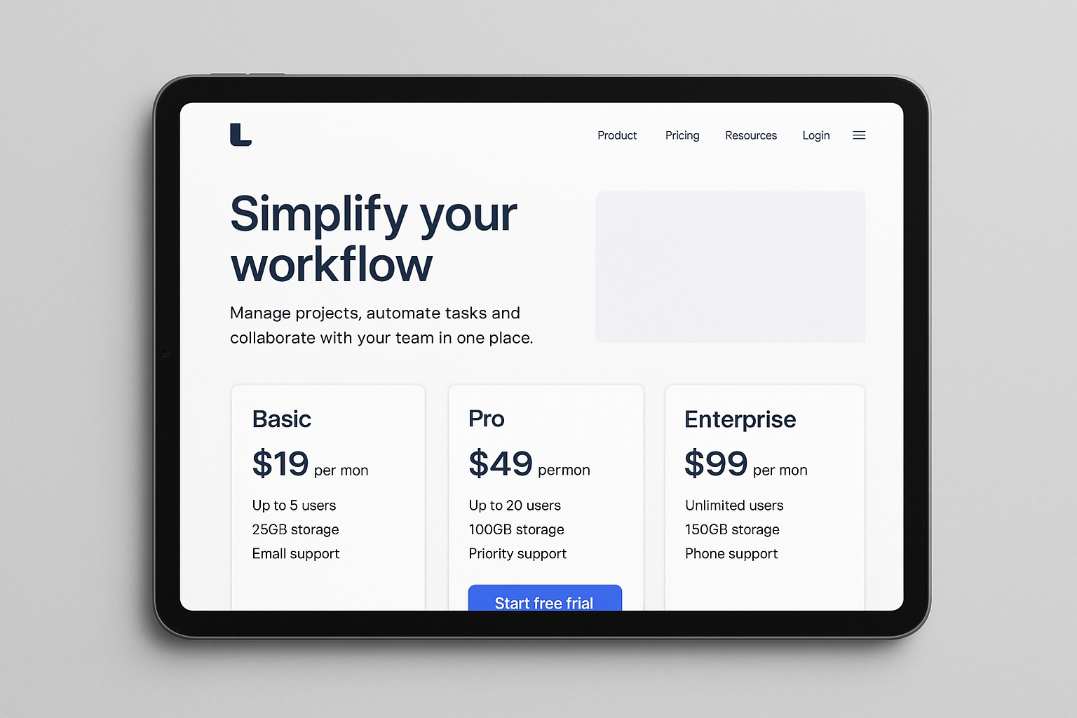
We initiated a comprehensive UX audit to pinpoint friction points. This analysis led to a strategic rewrite of the value proposition, making it more compelling and immediate. The core of our strategy was a complete redesign of the crucial "above-the-fold" section, creating a clear pricing comparison table, and integrating social proof blocks to build trust and credibility.
Deliverables
- Wireframes (mobile/desktop)
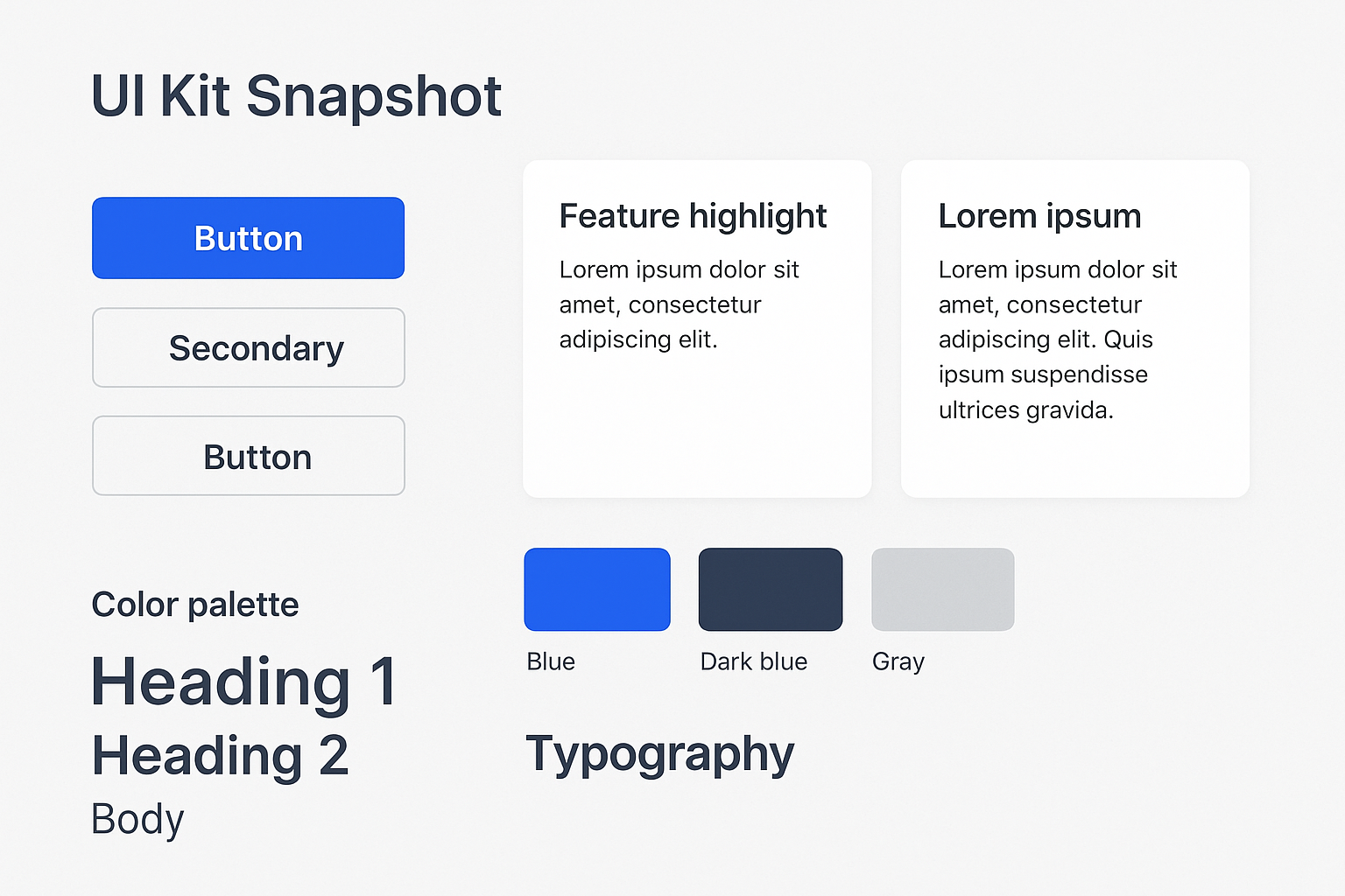
- High-fidelity mockups
- Component library (buttons, cards, CTAs)
- Micro-interaction specifications
- Accessibility checklist (WCAG 2.2 AA)
B2B SaaS with low trial sign-ups.
Increase trial conversions from the homepage.
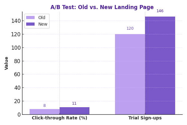
+38% CTA Click-Through
+22% Trial Starts
Project Showcase
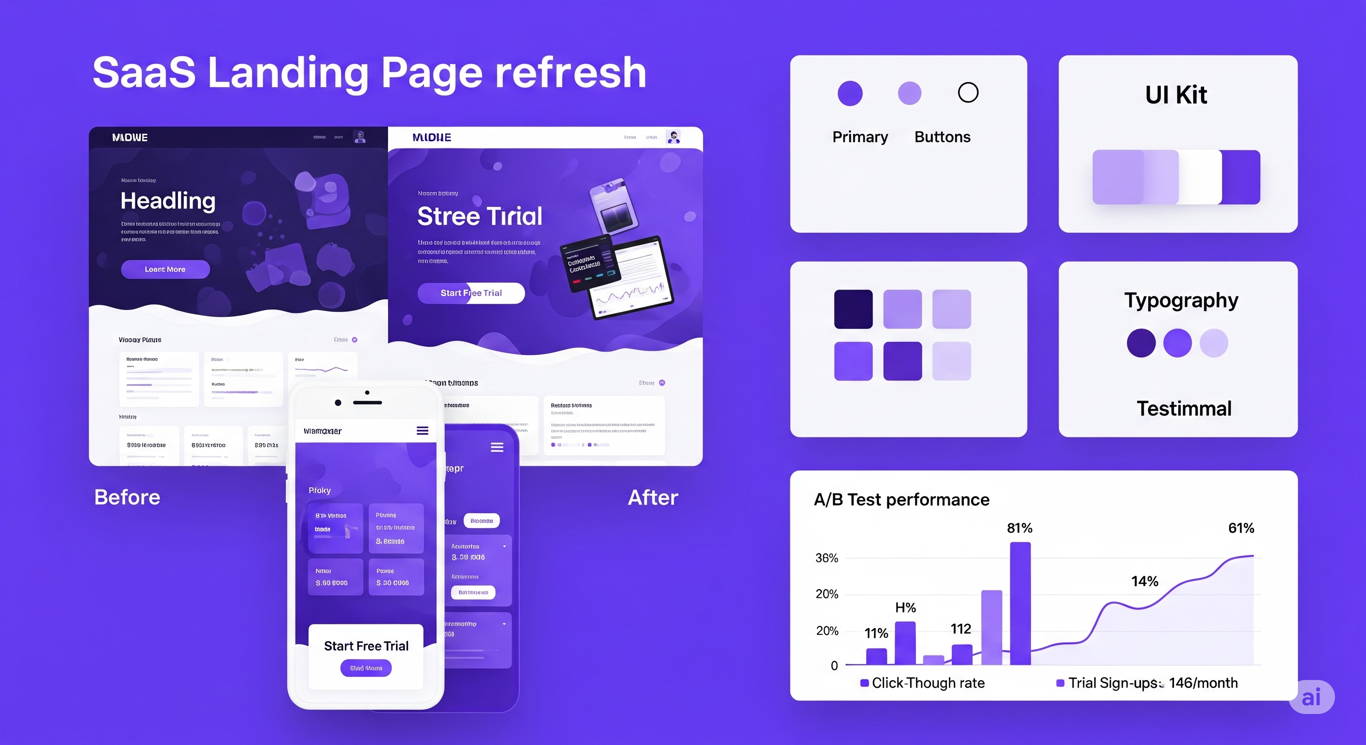
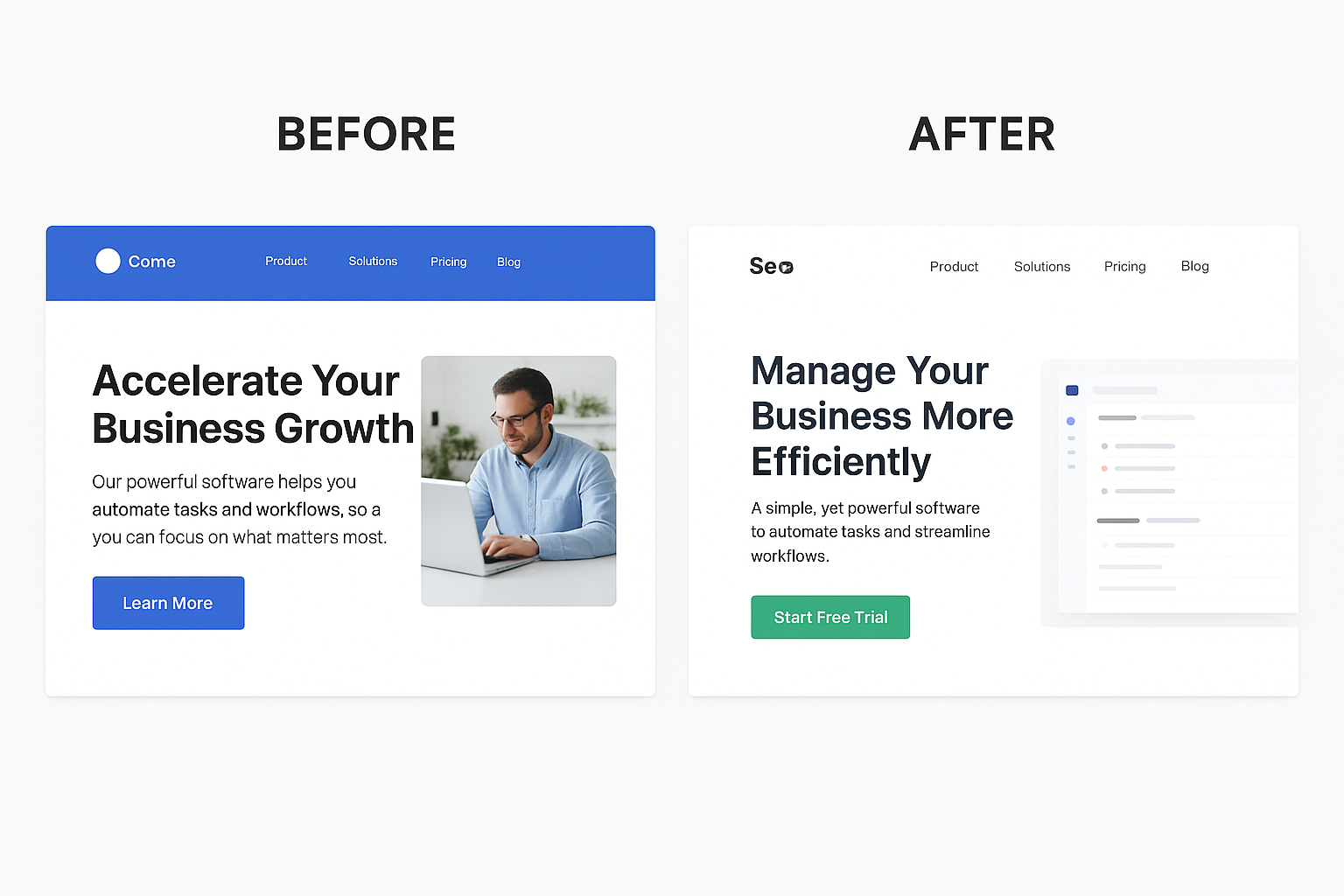
Before & After Hero Section
Mobile Layout
UI Kit Snapshot
A/B Test Mock Chart